Impact & Funding Dashboard
I partnered with a startup to redesign its impact‑funding platform used by philanthropy teams to understand portfolio health and identify risks across programs and projects.
Year
2025
Service
Dashboard design
Scope
Sitemap, user flow, home dashboard, portfolio and project workspace.
Design goals
Make complex financial and impact data easier to scan, compare, and act on through clearer structure and modern UI, and introduce AI‑assisted insights for faster decision‑making.

Problem
Key metrics were buried in dense tables and scattered across multiple pages, making it hard to get a complete picture of portfolio health.
The side navigation and overall flows were unclear, causing confusion about how the product worked and where to perform key tasks.
The UI felt outdated and inconsistent, with weak visual hierarchy and underdeveloped layouts, reducing trust and usability.

Process
Understanding users and tasks
Primary users: program managers, finance leads, and impact analysts who review portfolio health, track risks, and prepare reports for leadership.
Critical tasks: identify at‑risk projects, check funding status across portfolios, and produce clear summaries for internal and external stakeholders.
Lightweight competitive and pattern research
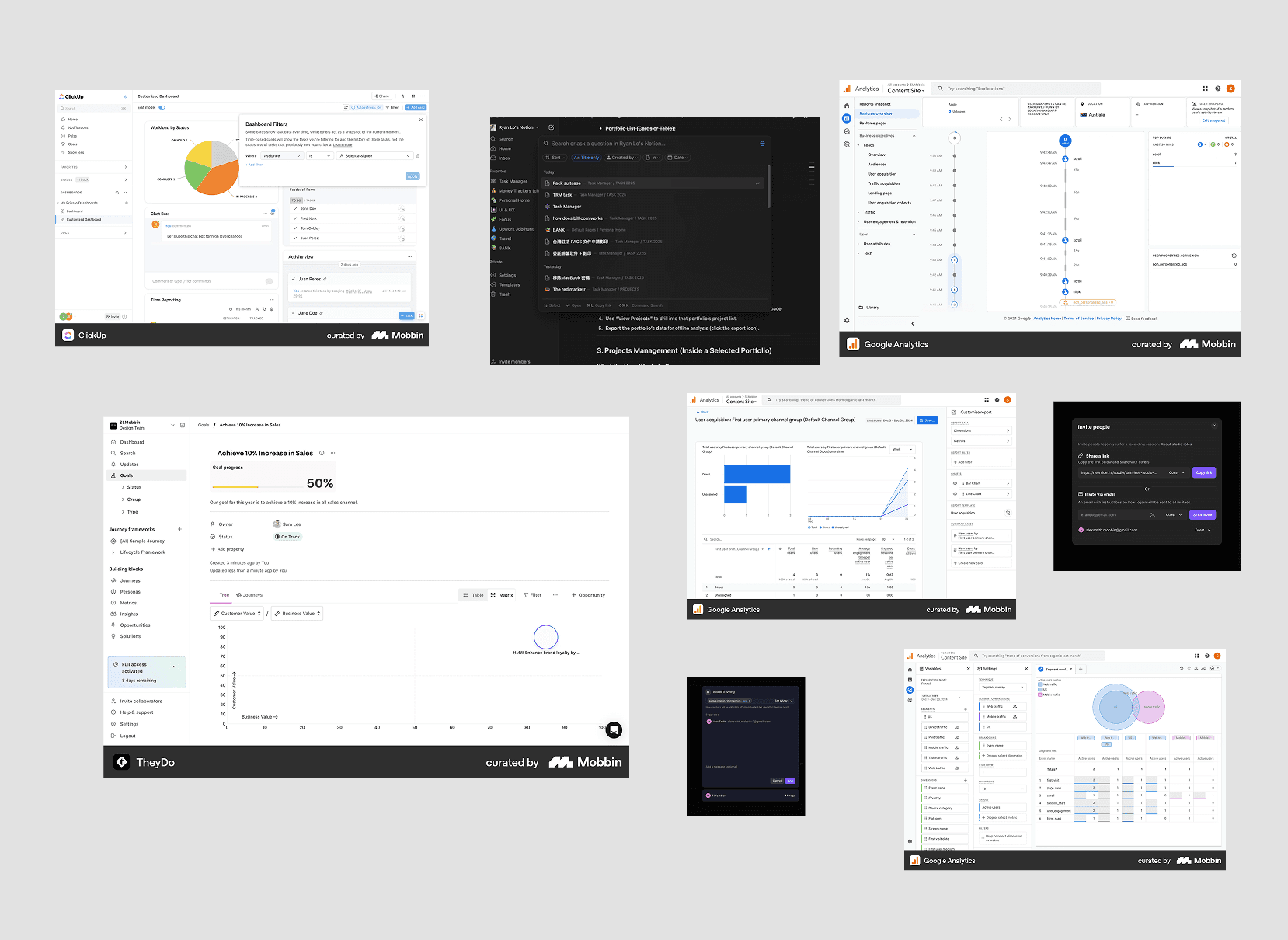
Given time constraints, I ran a focused scan using Mobbin and live analytics/fintech tools to see how other products present dense metrics, dashboards, and data tables.
I studied navigation patterns, summary cards, alert systems, and drill‑down interactions from overview to detail. This research informed decisions like using KPI summaries, sortable tables, and clear alert states, adapted to the impact‑funding context.
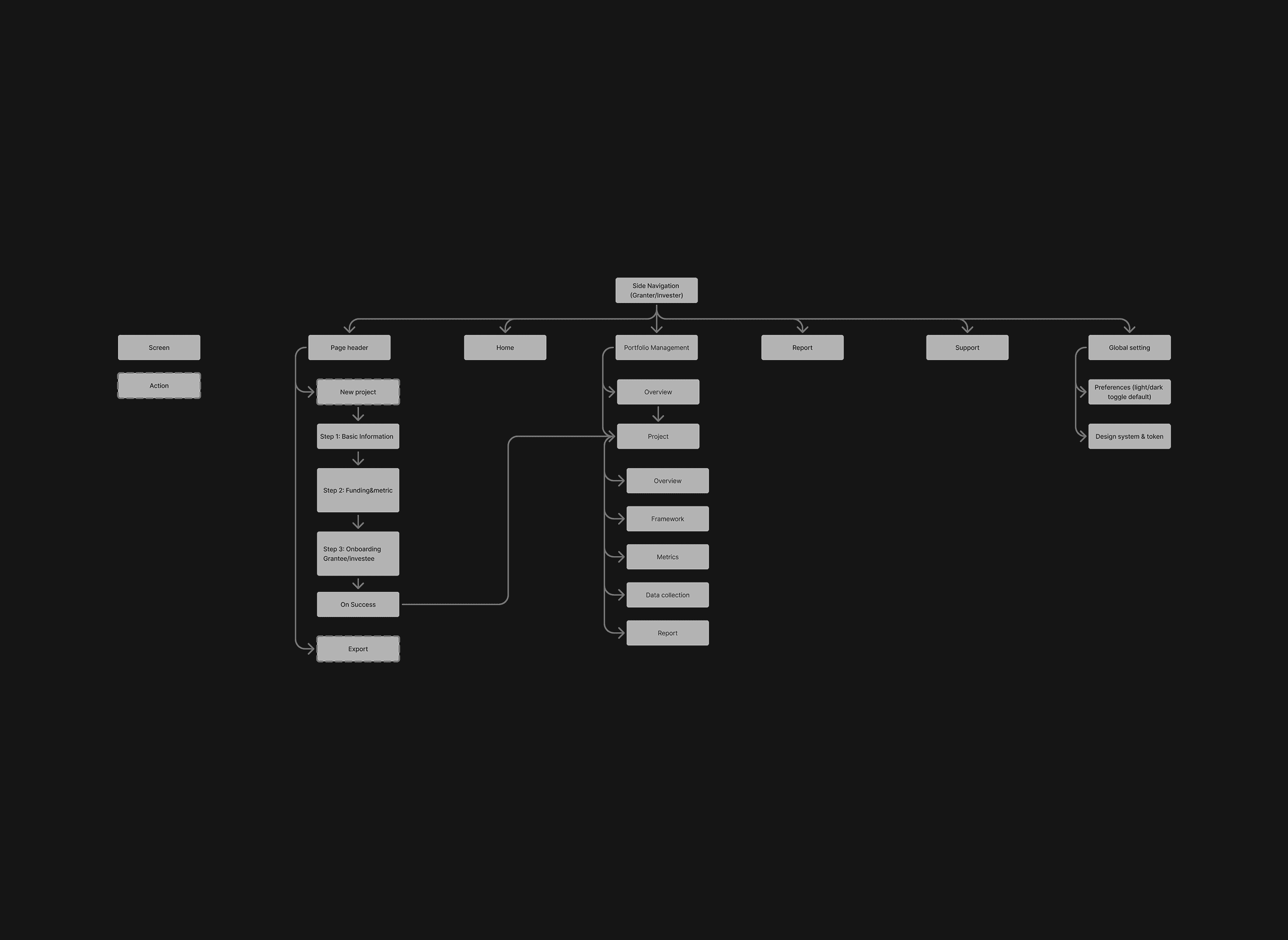
Structuring information and flows
I re‑organized the product into a clearer information architecture and task‑oriented flows.
I mapped user journeys around core questions such as “What’s the overall health of my portfolio?” and “Which projects need attention now?” and ensured each step showed the right level of detail at the right time.
Key design decisions
Home dashboard
Introduced a home screen with 3–5 critical metrics (active projects, total funding, beneficiaries, projects at risk) at the top, so users can quickly understand overall health.
Highlighted anomalies and trends using refined charts, visual indicators, and alerts to draw attention to what needs action.

Project workspace
Structured key tasks: Plan, Data, Analyse, Reports into a clear side panel for each project, so users immediately see what they can do in that context.
Designed a project summary pane showing report key metrics with tabs for deeper financials and impact insight.

Visual and interaction design
Simplified layouts and typography to improve scanability of dense data while maintaining a professional, product‑ready look.
Designed light and dark modes in parallel to ensure contrast, consistency, and comfort for long work sessions across different environments.

AI feature
Designed a contextual chat assistant that reads portfolio data, surfaces anomalies and high-risk items, and guides users with clear, prioritized actions and quick links to relevant screens.

Outcomes and learnings
The project was paused before a full release, so long‑term impact could not be measured quantitatively. However, early stakeholder reviews indicated that the new structure made it easier to grasp portfolio health and quickly spot at‑risk projects. If continued, next steps would include validating key flows with real users, iterating on the AI‑assisted insights, and enhancing filtering for large, complex portfolios.


